RestroX (SaaS UI Animation)
After Effects Project File Breakdown
Project Overview
Client: RestroX
Duration: 32 seconds
Project Type: SaaS explainer
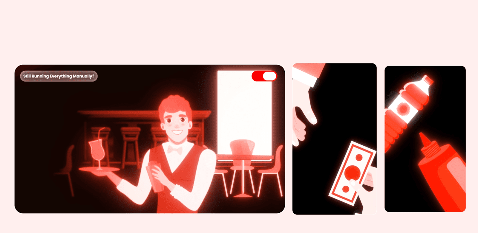
This project is a full-length SaaS explainer focused on common operational problems in restaurants and how RestroX addresses them through a unified software platform. The animation combines 2D illustrated scenes, UI screen showcases, selective stock footage, and text-led transitions. The visual language is anchored heavily in RestroX’s red brand palette, with neutral backgrounds to maintain clarity and contrast.
The goal of the animation is clarity and sequencing, not visual experimentation. Each scene is designed to communicate one problem or feature at a time, aligned tightly with voiceover pacing.
Creative & Motion Intent
The motion approach prioritizes readability, brand consistency, and logical flow.
Key creative decisions:
Use of flat 2D scenes to establish relatable restaurant contexts before introducing software screens.
Red brand tones are dominant but controlled, often balanced with light backgrounds and glass-style UI elements to avoid visual fatigue.
Motion is smooth and deliberate—no jitter or erratic movement—so the explainer feels stable and trustworthy.
Transitions are purpose-driven: scenes change when the narrative changes, not for visual novelty.
The animation avoids over-layered motion. Most scenes rely on entry → hold → exit patterns to give viewers enough time to process information.
Animation Structure
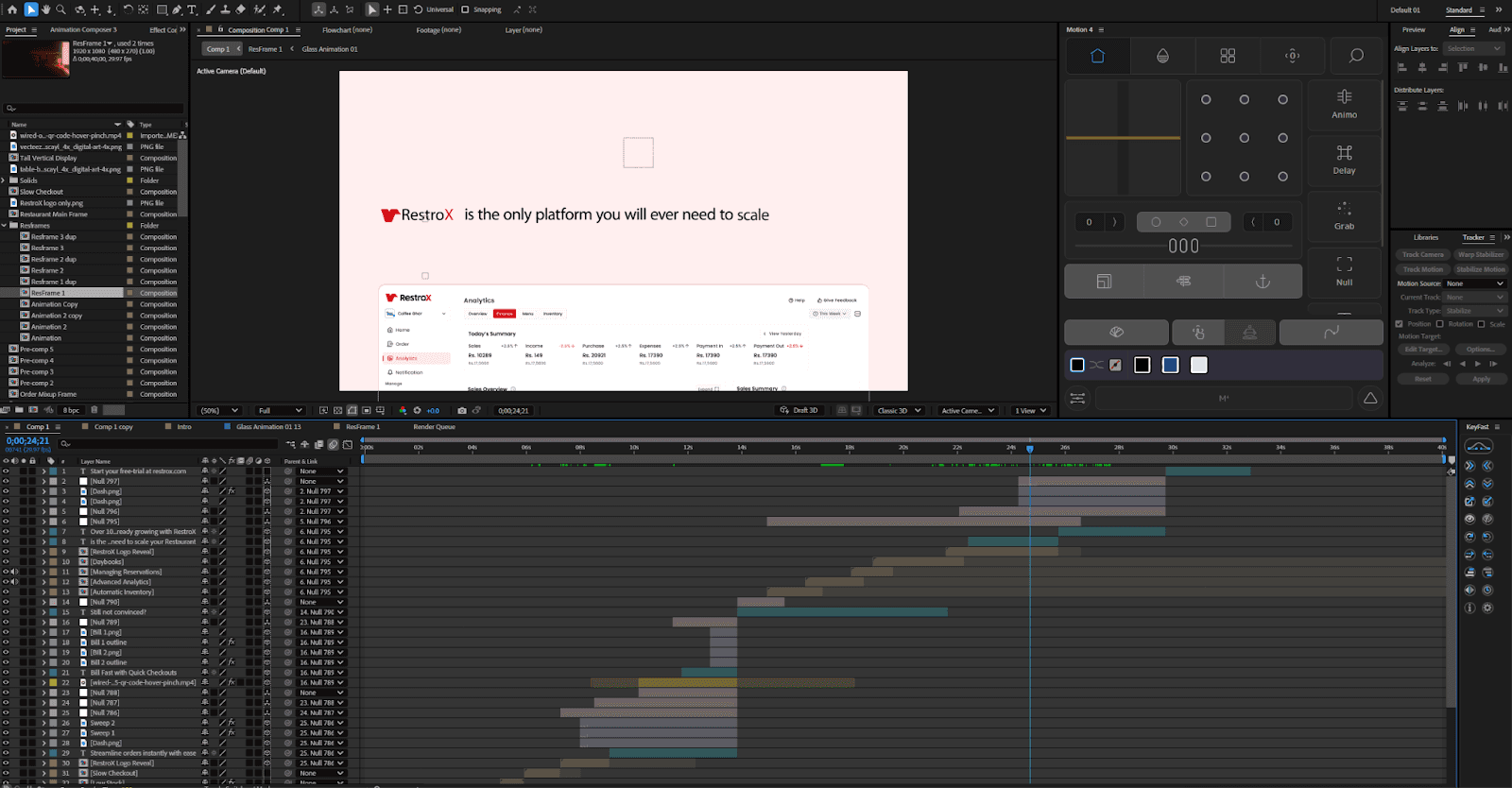
The project is built around a scene-based pre-comp structure.
High-level structure:
Each narrative beat (problem, feature, solution) lives in its own pre-comp.
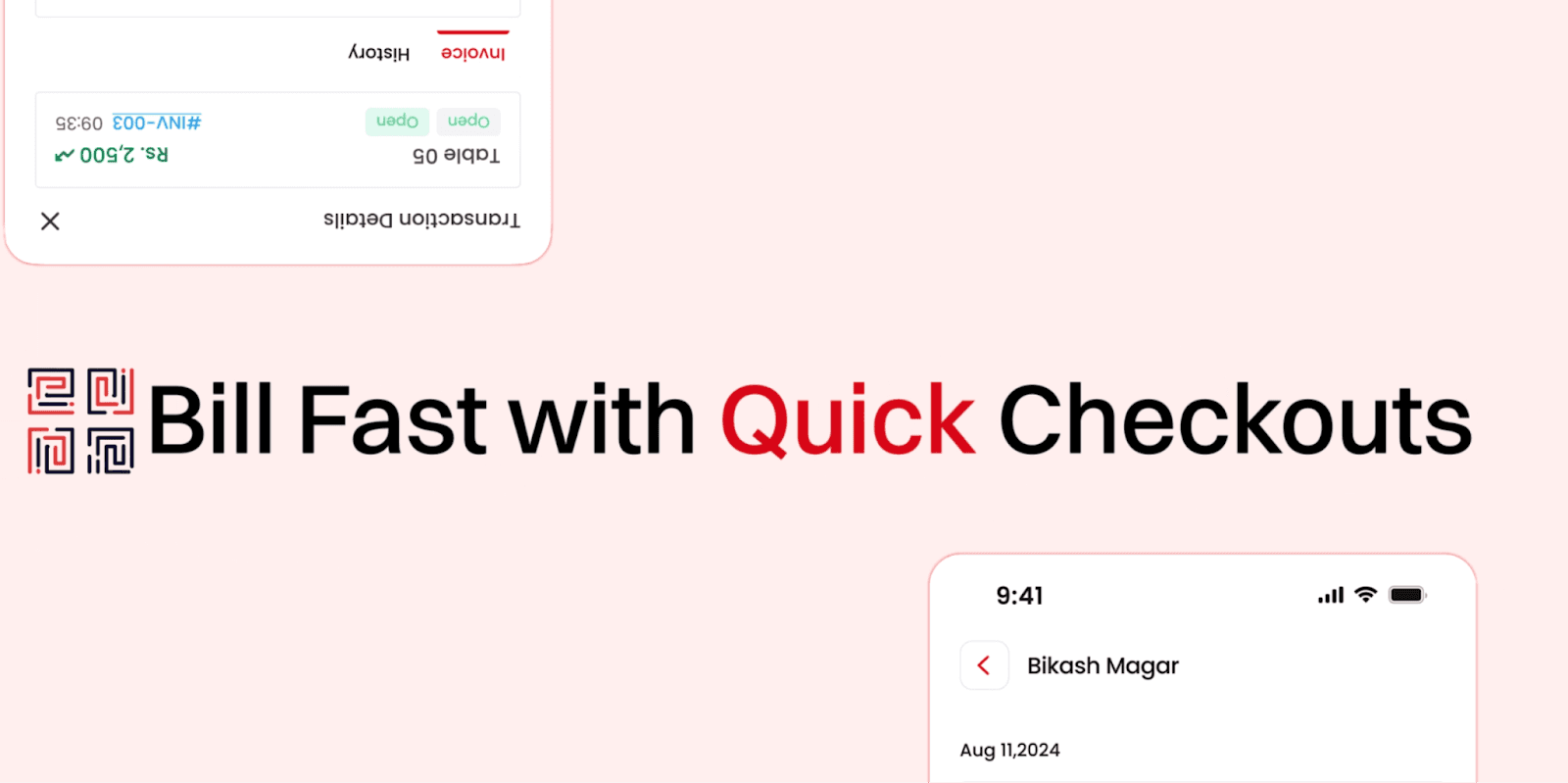
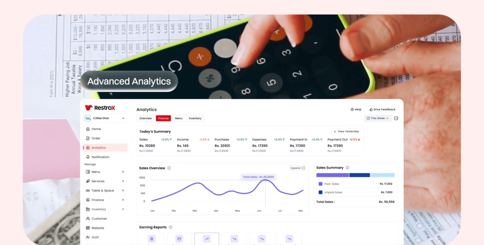
UI animations are isolated inside dedicated “App” and feature-specific pre-comps (e.g., Automatic Inventory, Managing Reservations, Daybooks).
Glass-style UI elements (buttons, message pills, highlights) are reused across scenes via multiple “Glass Animation” pre-comps.
Typical scene flow:
Background environment or illustration establishes context.
Text or problem label enters first.
Supporting visual (UI, icon, footage) animates in second.
Scene holds briefly for comprehension.
Elements exit or are replaced cleanly by the next scene.
This modular structure allows scenes to be adjusted, replaced, or reordered without breaking the main timeline.
Tools, Effects & Assets
Primary Tool: After Effects (Classic & Advanced 3D used selectively)
Effects are used for control and polish, not spectacle:
Gradients & color: 4-Color Gradient, Gradient Ramp, Curves, Tint, Fill
Depth & softness: Gaussian Blur, Fast Box Blur, Compound Blur, Camera Lens Blur
Highlighting UI: CC Light Sweep, Deep Glow 2 (used subtly on glass elements)
Motion control: Transform, Slider Control, Point Control, Angle Control
Compositing: Set Matte, Luma Key, Displacement Map
Glass UI elements are based on pre-built assets (Bentomotion Liquid Glass Kit), but heavily adjusted for brand color and opacity consistency.
Fonts are kept minimal:
Archivo Roman – Black for strong, legible on-screen text.
Assets include:
Figma-exported UI screens
Upscaled illustrations and icons
Limited stock footage is used only where real-world context adds value
Workflow Notes
Naming consistency is critical: repeated “Glass Animation” comps follow numbered variants rather than ad-hoc duplication.
UI screens are never animated directly in the main comp—always nested—so text or screen updates don’t ripple through the timeline.
Duplicate “Resframe” comps are used to test layout variations without breaking approved scenes.
Audio (VO, SFX, ambient) is centralized and referenced, not scattered across scene comps.
This project demonstrates disciplined pre-comp usage to manage a long explainer without timeline clutter.
Learning Takeaways for New Editors
Long SaaS explainers succeed through structure, not complexity.
Pre-comp everything that might change: UI, text blocks, feature sections.
Motion should support narration timing—never rush information.
Reusable UI elements (buttons, pills, highlights) save time and improve consistency.
Brand color dominance must be balanced with contrast and breathing space.
Conclusion
The RestroX explainer is a strong example of controlled SaaS motion design. Its success comes from clean structure, intentional pacing, and disciplined use of effects rather than visual excess. For new editors, this project highlights how thoughtful pre-comp planning and motion restraint are essential when building longer, information-heavy animations.