Feature Activate Card (Glass UI)
After Effects Project File Breakdown
Project Overview
Project Type: SaaS UI Motion
Duration: ~4 seconds
Software: After Effects
Focus Area: Glassmorphism, UI hierarchy, micro-interactions
1. Project Overview & Intent
This project is a short SaaS-style UI animation designed to showcase feature activation in a premium, modern way.
The primary objective was visual polish, not storytelling.
The animation communicates:
Feature availability
Interactivity (toggles)
A clear final action (CTA)
The standout element is the glass UI effect, which elevates the perceived quality of the interface.
2. Background Setup (Leaf Footage)
The animation begins with a soft-focus leaf video as the background.
Why a natural background:
Organic texture contrasts with clean UI
Adds depth behind the glass effect
Prevents the interface from feeling flat or sterile
Execution Notes:
Background slightly blurred
Color adjusted using Hue/Saturation
Grain added for consistency

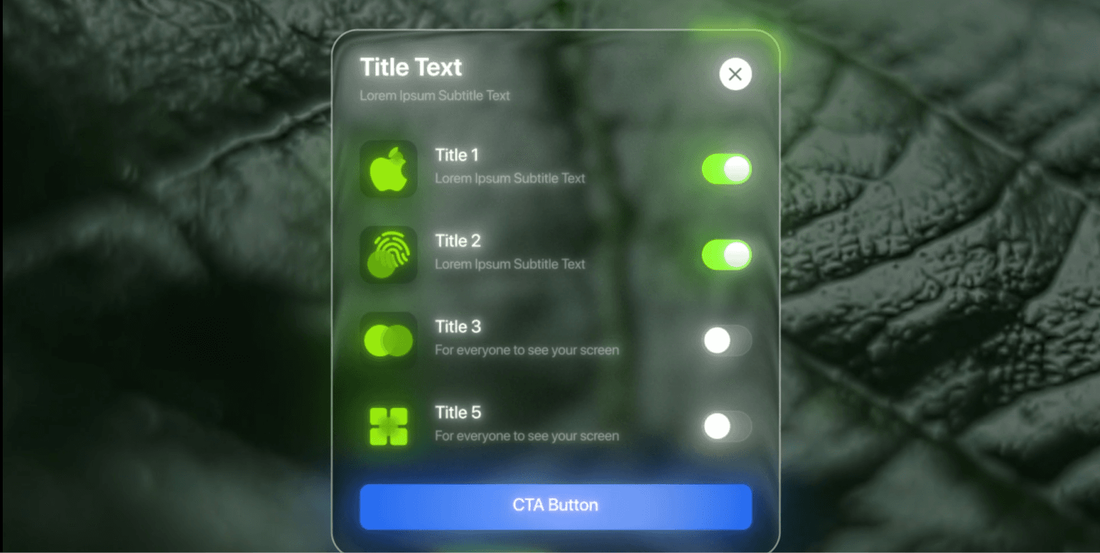
3. Glass Card Entry (Core Visual Element)
The glass UI card slides in as the main focal point.
Glass Effect Construction:
Semi-transparent card shape
Background blur via Gaussian Blur
Subtle noise to avoid banding
Light displacement for distortion
Soft drop shadow for separation
Why this matters:
Glassmorphism works only when:
Blur is controlled (not overdone)
Edges are clean
Background has visible texture
This is what gives the animation its premium feel.
4. UI Structure & Hierarchy
The card is broken into multiple logical pre-comps:
Top info (title + close icon)
Settings list
Individual setting rows
CTA button
Reasoning:
The modular structure allows fast changes
Each UI element can be animated independently
Easier for scaling or reuse in future projects
This is standard practice for clean SaaS motion projects.
5. Feature Toggles & Micro-Interactions
Each feature row contains:
Icon
Text label
Toggle switch
Toggle Animation:
Position shift
Fill color change
Subtle glow on activation
Why toggles are important:
They imply user control, even if the interaction is simulated.
Key Effects Used:
Slider Control (for smooth state changes)
Fill
Transform
Deep Glow 2
6. Timing & Motion Style
The animation uses:
Staggered entrances for list items
Short easing curves
Minimal overshoot
Design Choice:
Fast, confident motion communicates:
Reliability
Professional software
No unnecessary distraction
Nothing lingers longer than needed.
7. CTA Button & Ending Frame
The animation ends with a CTA button appearing at the bottom of the card.
CTA Purpose:
Anchor the viewer’s attention
Signal completion
Suggest next action
The button uses:
Solid color (blue) for contrast
Slight glow
Clean scale-in animation
8. Effects & Technical Notes
Primary Effects Used:
Gaussian Blur
Noise
Displacement Map
Deep Glow 2
Drop Shadow
Transform
Rendering Mode: Classic 3D
Font Used: SF Pro Display (Bold)
No unnecessary plugins, the premium look comes from layer discipline and restraint, not complexity.
Key Takeaways from This Project
Glass effects rely more on background choice than effects
Modular pre-comps are essential for UI animation
Micro-interactions add perceived interactivity
Short SaaS animations benefit from fast, confident motion
Conclusion
The Feature Activate Card project demonstrates how thoughtful use of glassmorphism, clean UI hierarchy, and subtle motion can dramatically elevate a short SaaS animation.
Rather than relying on heavy effects or complex animation, this project focuses on clarity, polish, and control, making it a strong reference for premium UI motion design.
This approach is especially effective for:
Product promos
Feature reveals
Landing page motion sections