Amazon Logo → Product → Payment Animation
After Effects Project File Breakdown
1. Project Overview
Project Type: Brand/concept motion animation
Duration: Short sequence
Primary Tool: Adobe After Effects
Project File: Amazon Concept PJ.aep
What this project represents:
A concept-driven brand animation where typography, icons, and products work together to tell a simple story.
2. Objective
The goal was to visually communicate the Amazon ecosystem in a short, engaging way:
Brand recognition (Amazon logo)
Product variety
Conversion moment (bag + payment notification)
The animation needed to feel:
Fast
Clear
Playful but controlled
3. Story & Motion Flow
The animation follows a linear visual narrative:
Amazon logo appears
Each letter transforms into a product
Products move toward the Amazon bag
Payment notifications appear
This clear sequence makes the concept easy to understand without text or voiceover.
4. Motion Approach
The motion relies on transformation and continuity rather than complex effects.
Key principles:
Each letter becomes a product instead of cutting abruptly
Motion direction always leads toward the bag
Timing increases slightly toward the “payment received” moment
This keeps momentum high and attention focused.
5. Key Animation Decisions
Letter-by-letter breakdown:
Each letter (A, M, A, Z, O, N) was animated in its own composition to keep control clean.Product replacement instead of overlay:
Letters visually transform into products rather than appearing randomly.Central gravity point:
All motion resolves toward the Amazon bag, reinforcing the brand message.
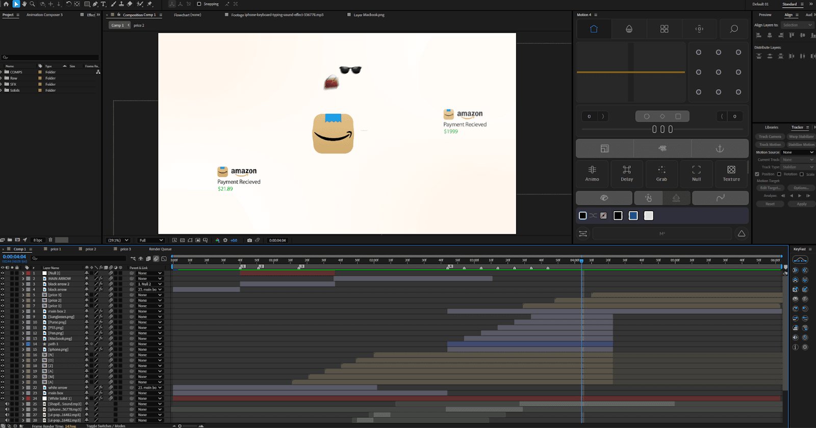
6. Layer & Composition Structure
The project is organized into multiple focused comps:
Individual letter comps (
A,M,A,Z,O,N)Price notification comps
One main assembly comp (
Comp 1)
This modular structure makes:
Timing changes easier
Reuse possible
Debugging faster
7. Effects & Styling
Used sparingly to support clarity:
Linear Wipe / Luma Key: for clean transitions
Bulge: subtle emphasis during transformations
Drop Shadow: separation from the background
Tint / 4-Color Gradient: color consistency
Effects enhance readability without becoming noticeable.
8. Sound Design Notes
Sound effects were used to reinforce interaction:
UI pops for payments
Whooshes for transitions
Subtle typing/texture sounds
Sound timing follows motion, not the other way around.
9. Common Mistakes to Avoid
Random product motion without direction
Overlapping too many elements at once
Inconsistent easing between letters
Letting sound effects overpower visuals
Clarity is more important than density.
10. Key Takeaways
Simple stories benefit from structured motion
Breaking animations into smaller comps improves control
Transformation feels more intentional than appearance
Motion should always support the narrative flow